See what I've been building.

Welcome back!

           
Signal Bars
          

JAMES

VREEKEN

I am passionate about optimizing and improving real people's experiences online through the use of clear content, simple navigation and dynamic, as well as aesthetically pleasing design.

One of my greatest skills is my ability to quickly anticipate end user & internal business needs without clear direction, as well as my ability to quickly and efficiently take and accept feedback from stakeholders and incorporate it into my designs.

I am a talented user experience architect with the proven know-how to combine creativity and cutting edge web technology; creating views and user flows that result in world-class web, desktop, and mobile applications.

(801) 400-5485

Find me on LinkedIn:
/in/jamesvreeken

Created a style guide and design system to replace an antiquated hodgepodge of 'frankenstyles and guided a frontend team of five front-end react developers and ten Java Backend developers. Designed and developed tazworks.com and created a seamless integration with Zendesk for tazsupport.com. Owned the end-to-end design function for new and existing features in a large data-driven application used by consumer reporting agencies in 1 out of every 10 background screening searches performed in the USA (~20 million searches / year).

Responsible for facilitating, generating and executing great user experiences for all clients and their end users. I coach, mentor and lead both internal teams as well as advocate for the clients' needs. Increased conversion rates on landing pages on average by over 500% and increased ROI for paid search on a wide variety of campaigns.

Designed and developed UX / UI concepts that solved how to visualize & interact with enormous volumes of content easily as well as designed beautifully functional and usable interfaces for the full range of enterprise level medical software products and services by amplifying its quality and value through solid user experience and user interface design.

Quickly adopted Adobe's internal standards and methods and worked diligently to hit tight deadlines. Improved relationships with the Japanese team by improving their design processes. Developed a unique system to improve the work efficiency of localizing landing pages.

Internet Technologies

Bachelor of Applied Science

I completed my education at Utah Valley University in 2011 with a 3.8 GPA. In a senior project I undertook a UX design project in which my partner and I took on the task of analyzing and formulating improvements to the in-car dashboard experiences of then current luxury vehicles.

Web & Graphic Design

Associates of Applied Science

Completed a two year associates degree in less than 1 year before serving a 2 year mission to Japan for the LDS church. I have always been interested in improving the user experience of computer programs and the Internet through aesthetically pleasing design and innately usable interface design.

Skills

  • UX/UI Design
  • HTML5/CSS3
  • SASS/LESS/SCSS
  • Agile Development
  • Rapid Prototyping
  • Responsive Design
  • Usability Testing
  • Javascript / jQuery
  • React.js

Software

  • Adobe CS
  • Balsamiq Mockups
  • Sublimetext
  • Webflow
  • Microsoft Office
  • Sketch
  • OmniGraffle
  • Invision
  • Terminal & Git
Thank you! Your submission has been received!
Oops! Something went wrong while submitting the form.

TazWorks

tazworks.com

Thomas Arts

thomasarts.com
Thomas Arts Mobile Site

Morgan Jewelers

morganjewelers.com
Morgan Jewelers

Aviacode

aviacode.com
Aviacode
Visual Design

Visual design

Visual Design

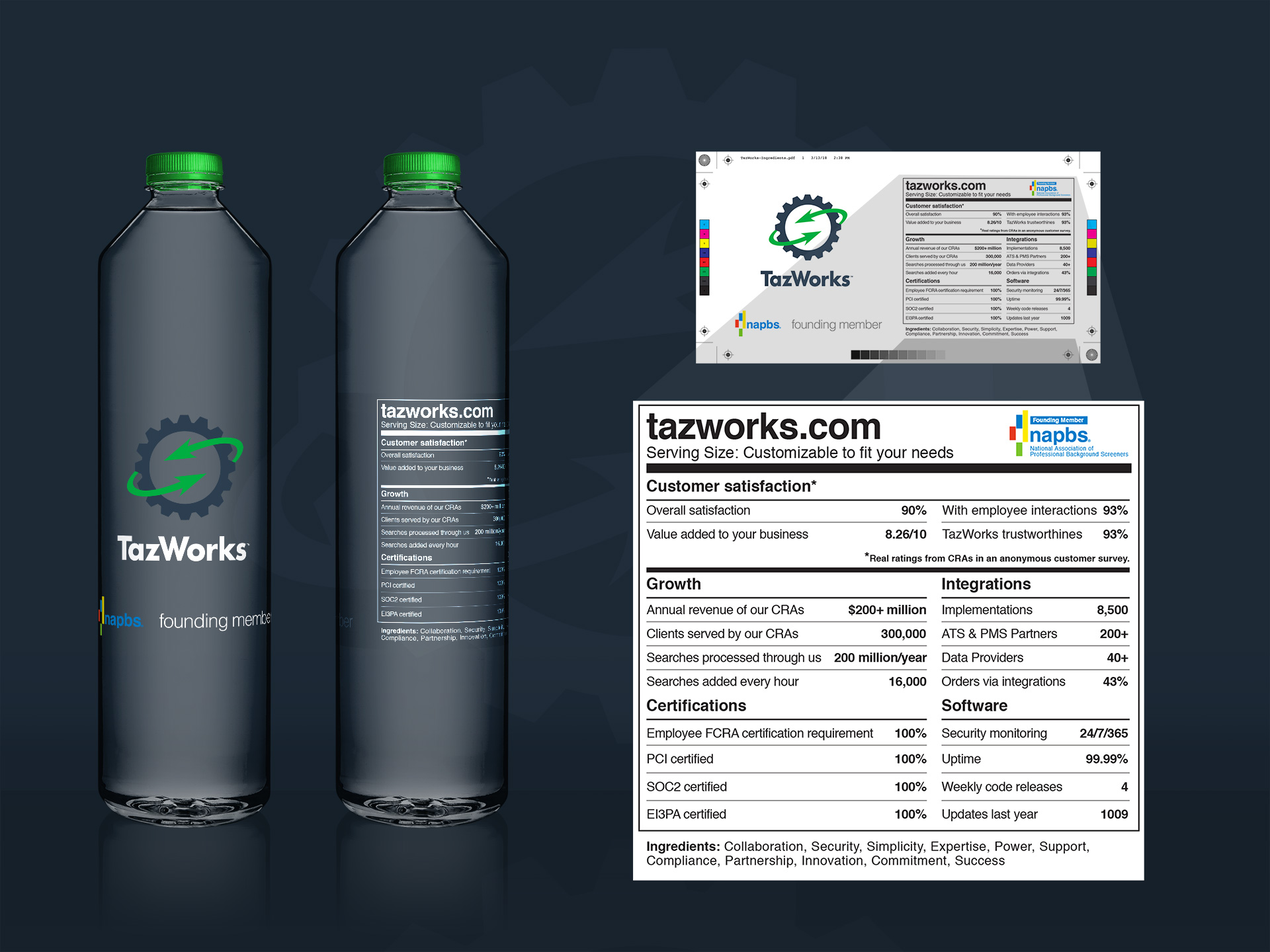
It is amazing to me to know how often those outside the discipline of design assume that what designers do is simply decoration — likely because so much "design" is simply just decoration.

Visual design is not about visuals.
Visual design is problem solving.

Illustrations & Animation

Illustrations & animation

Illustrations & Animation

I love blurring the line between hand-drawn and digital when creating illustrations and animation.

There is something about work that looks like it’s been crafted traditionally, but also incorporates a digital touch, by incorporating effects such as parallax.

Data Visualization

Data visualization

Data Visualization

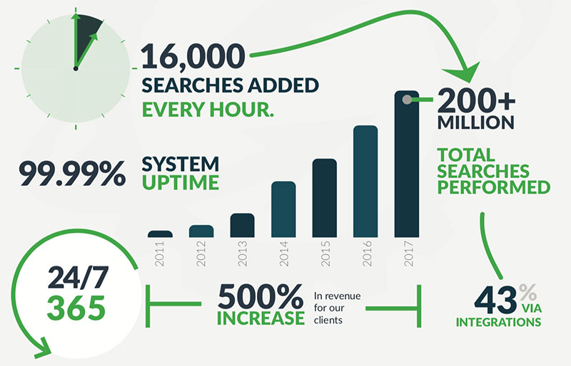
Good data visualization is all about conveying information clearly, efficiently, and without distraction.

A good rule of thumb to follow is that if you can’t understand it, you’re audience probably won't be able to either.

Prototyping

Rapid prototyping

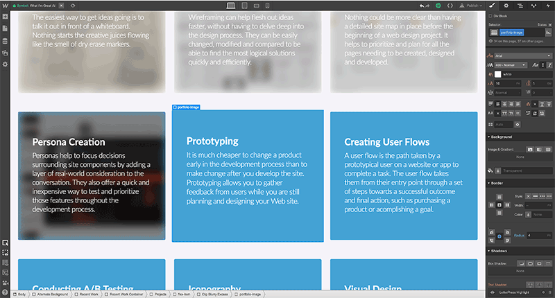
It is much cheaper to change a product early in the development process than to make changes after development.

Prototyping allows me to gather feedback quickly, and iterate on designs faster.

Site Mapping

Site mapping

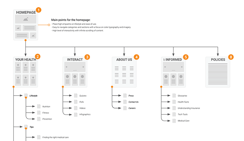
Nothing could be more clear than having a detailed site map in place before the beginning of a project.

It helps to prioritize and plan for all the views needing to be created, designed and developed.

Creating User Flows

Creating user flows

Creating User Flows

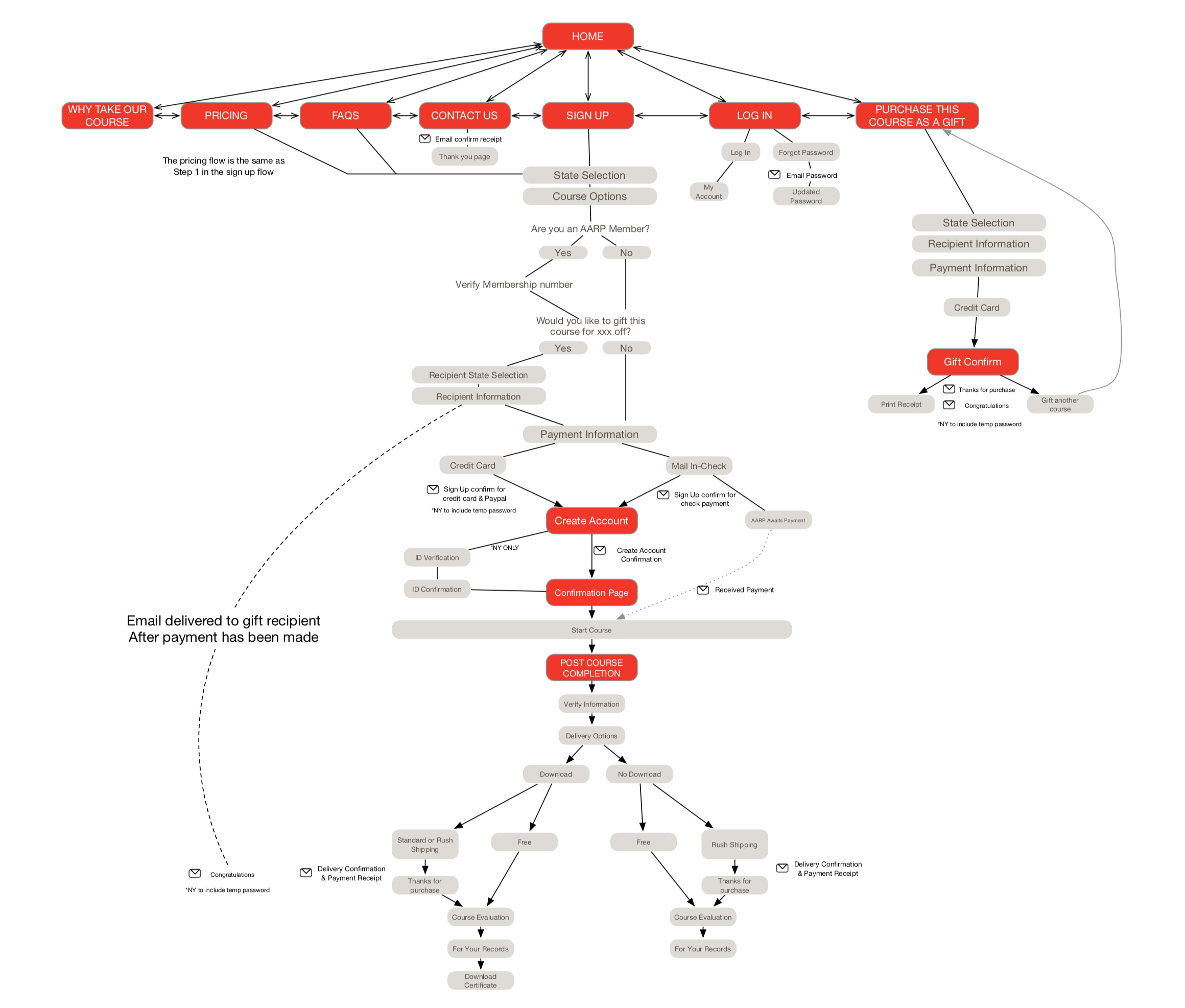
A user flow is the path taken by a prototypical user on a website or app to complete a task.

The user flow takes them from their entry point through a set of steps towards a successful outcome and final action, such as purchasing a product or accomplishing a goal.

Wireframing

Wire-framing & sketching

Wireframing

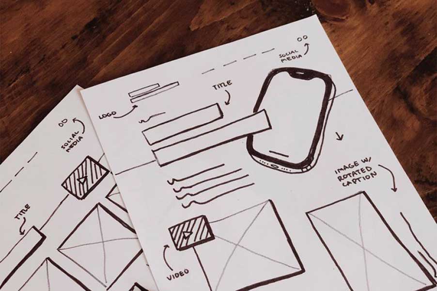
Wire-framing can help flesh out ideas faster, without having to delve deep into the design process.

They can be easily changed, modified and compared to be able to find the most logical solutions quickly and efficiently.

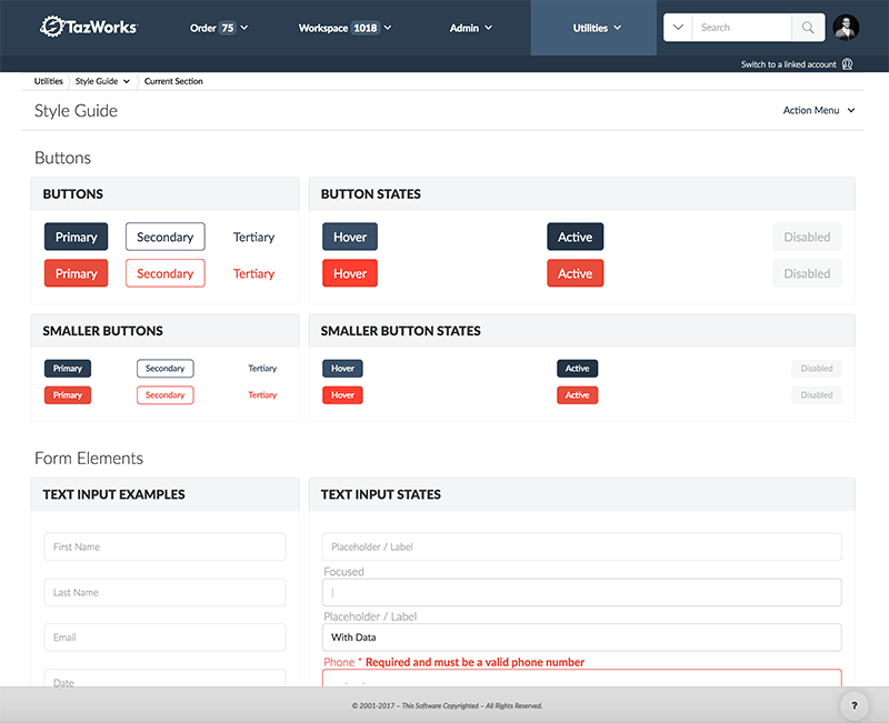
Style Guides

Style guides

A must for any complex user-facing digital product — style guides are best created when they come from experimentation and making mistakes, and not by following standards.

Style guides allow the user interface of your product to be highly consistent and cohesive.

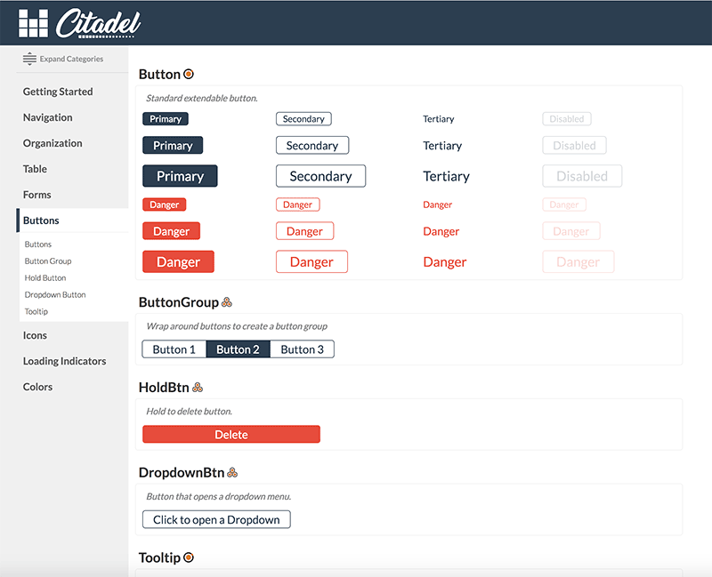
Design Systems

Design systems

A design system is the complete set of design standards, documentation, and principles along with the toolkit (UI patterns, code components, visual style guide and so forth) to achieve those standards.

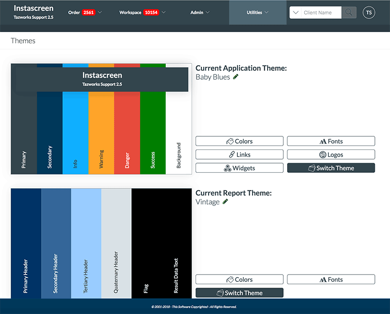
Theming

Theming

Color is a core building block of any design system, and it has proven to be one of the most challenging design problems to take on.

I have experience with the intricacies of designing around a system that is customizable yet at the same time easy to use.

Usability Testing

Usability testing

Usability testing can help the design and development teams identify problems before they are coded.

Issues found early can be more easily identified and fixed before they grow too complex or require a complete rewrite or redesign of the entire project.

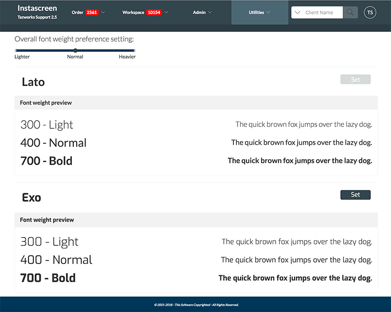
Typography

Typography

Typography is the art of arranging type. It might sound simple, but there’s a lot that goes into it, like choosing typefaces, point sizes, colours, and designing the spaces between text blocks, lines and letters.

Iconography

Iconography

Icons are an essential part of many user interfaces, visually expressing objects, actions and ideas.

When done correctly, icons can communicate the core idea and intent of a product or action, and they bring a lot of nice benefits to user interfaces, such as saving screen real estate and enhancing aesthetic appeal. 

Conducting A/B Testing

Conducting A/B testing

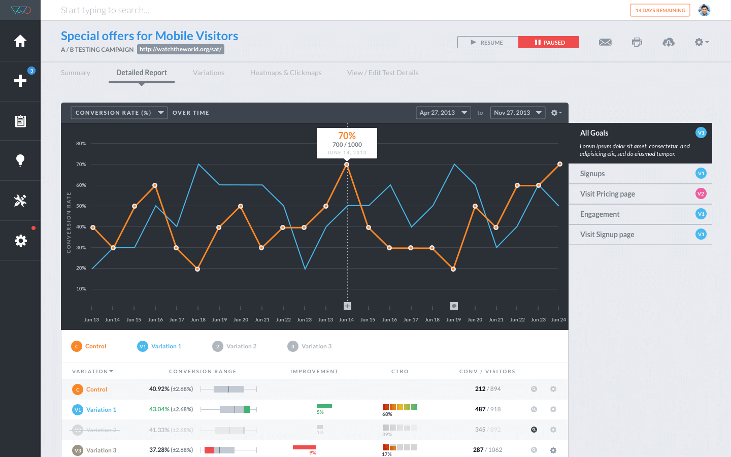
Comparing two versions of a design to see which one performs better.

A/B testing is essentially an experiment where two or more variants of a design are shown to users at random, and statistical analysis is used to determine which variation performs better for any given goal.

Persona Creation

Persona creation

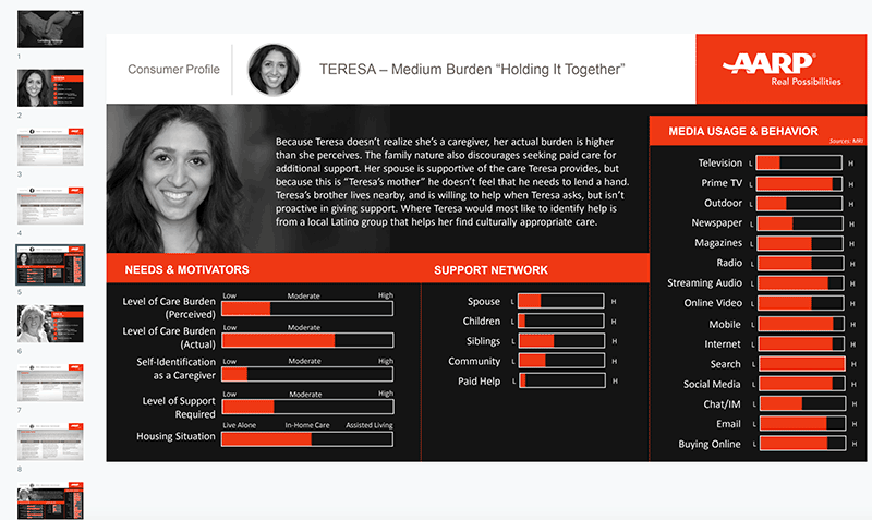
Personas help to focus decisions surrounding site components by adding a layer of real-world consideration to the conversation.

Personas offer a quick and inexpensive way to test and prioritize those features throughout the development process.

Information Architecture

Information architecture

Information Architecture

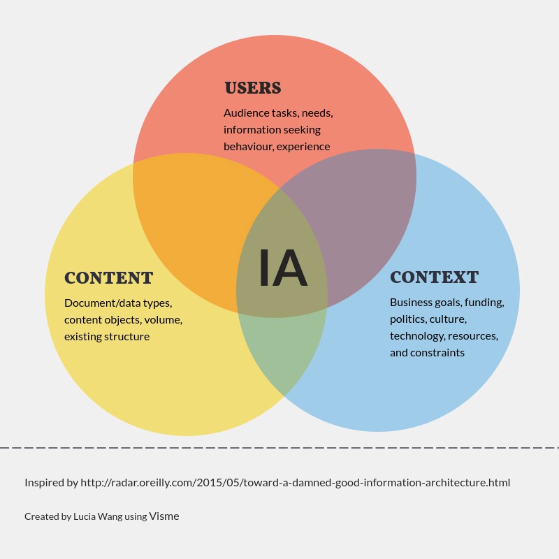
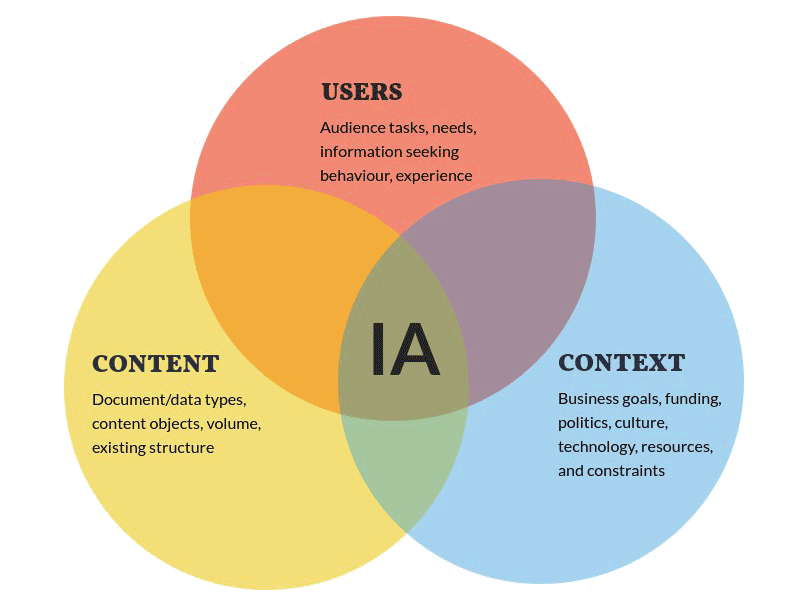
Basically the blueprints behind the design structure and can be generated into wireframes and sitemaps of the design.

Visual elements, functionality, interactions, and navigation built according to information architecture principles reduce the likelihood of problems of poor usability and navigation.